ベックマン・コールター ライフサイエンス

Fluorochrome Guide
 ポスターお申し込み

Click the HTML icon in the toolbar above to edit spacer height.
TO EDIT: Change the class="spacer-3" to any number between 0 (none) and 5 (most) to resize a spacer. Ex. class="spacer-5"
Vertical spacers are responsive and 50% smaller on mobile than on tablet+.
mtjp-flo-poster-download-23-02-img-fluorochrome.jpg

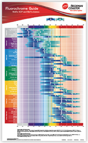
各蛍光色素の励起波長と最大蛍光波長がわかる“Fluorochrome Guide”の配布をしています。
ソーターだけではなく、アナライザーをお使いの方にも幅広くお使いいただけます。
是非この機会にお申し込みください。

自動返信メールでPDFダウンロードリンクをメールにてお送りします。
印刷したポスターをご希望の場合は、問い合わせ欄に「ポスター発送希望」とご入力ください。

お申し込みフォーム
Click the HTML icon in the toolbar above to edit spacer height.
TO EDIT: Change the class="spacer-3" to any number between 0 (none) and 5 (most) to resize a spacer. Ex. class="spacer-5"
Vertical spacers are responsive and 50% smaller on mobile than on tablet+.

LG Heading (h3)

LG Heading (h3)

Drop Volume 25nl
Volume Transfer Range 25nl - 5ul one well to one well
Transfer Accuracy <10% deviation from target volume
Drop Volume 25nl
Volume Transfer Range 25nl - 5ul one well to one well
Transfer Accuracy <10% deviation from target volume
Click the HTML icon in the toolbar above to edit spacer height.
TO EDIT: Change the class="spacer-3" to any number between 0 (none) and 5 (most) to resize a spacer. Ex. class="spacer-5"
Vertical spacers are responsive and 50% smaller on mobile than on tablet+.
Click the HTML icon in the toolbar above to edit spacer height.
TO EDIT: Change the class="spacer-3" to any number between 0 (none) and 5 (most) to resize a spacer. Ex. class="spacer-5"
Vertical spacers are responsive and 50% smaller on mobile than on tablet+.

LG Heading (h3)

Click the HTML icon in the toolbar above to edit spacer height.
TO EDIT: Change the class="spacer-3" to any number between 0 (none) and 5 (most) to resize a spacer. Ex. class="spacer-5"
Vertical spacers are responsive and 50% smaller on mobile than on tablet+.
Click the HTML icon in the toolbar above to edit spacer height.
TO EDIT: Change the class="spacer-3" to any number between 0 (none) and 5 (most) to resize a spacer. Ex. class="spacer-5"
Vertical spacers are responsive and 50% smaller on mobile than on tablet+.